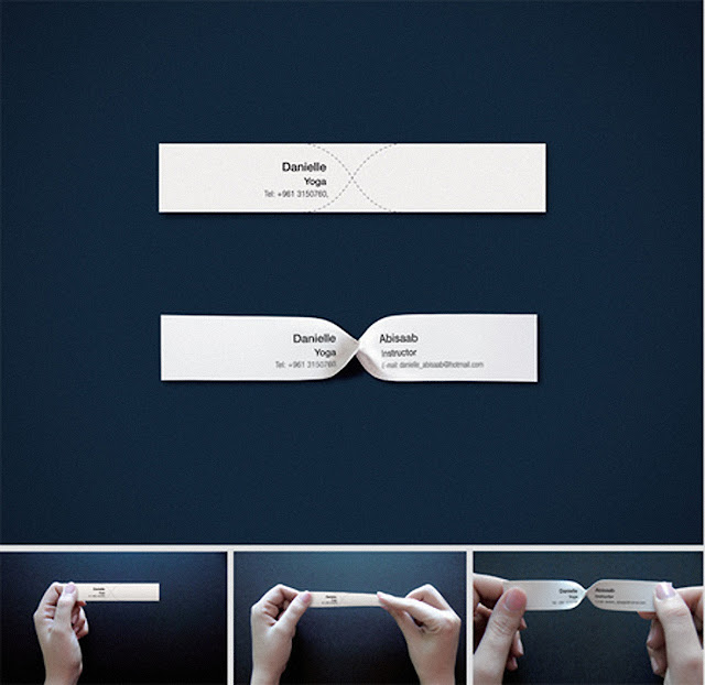
A really clever design by By Kapil Bhimekar
Here's its story...
Problem: The Number of yoga centers in Beirut were growing rapidly. Danielle Abisaab,
a yoga instructor for over 10 years needed to re-position herself.
Premise: Most Yoga postures/exercises involve twisting of the body. We adapted this observation on to our business card design
Idea: We started by choosing a non-tearable and flexible paper to print our visiting card on. The messaging was then divided into two equal parts. With one half printed on the front and the other half on the back. To read the entire message the user would have to twist the visiting card. Folding lines were printed on both sides of the card to guide the user while twisting the visiting card.
Results: The visiting card gave her business a new twist. Enquiries kept flowing and new students
enrolled for yoga programs.


0 comments:
Post a Comment